UX Designer
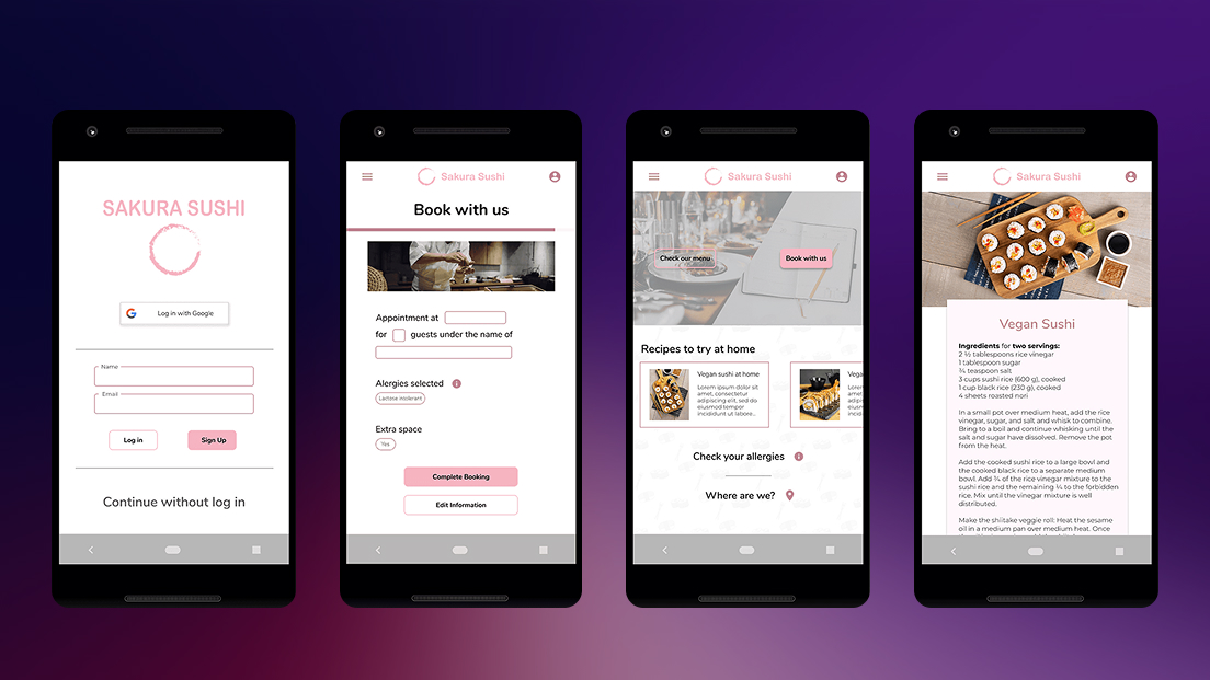
Sakura Sushi
A goal-directed booking application designed around persona creation and user objectives, streamlining restaurant reservations while providing essential information.
Role
UX Designer
Timeline
4 weeks
Tools
Figma
Team
Solo project
The problem
Most restaurant booking apps treat reservations as a simple transaction: pick a date, pick a time, done. But for users with dietary restrictions, allergies, or those planning group meals, the lack of accessible nutritional and menu information forces them to leave the app entirely — searching restaurant websites, calling ahead, or simply choosing somewhere else.
Sakura Sushi started with a question: what if the booking experience also helped users make informed decisions about what they’ll eat?
Research & Discovery
I began with an assumption that most users just want to book quickly and move on. Early interviews challenged that directly.
Conversations with potential users revealed two underserved groups: people managing food allergies who need ingredient-level detail before committing to a restaurant, and users organizing meals for others — parents with children who have medical dietary needs, or professionals booking for groups with varied preferences. For both groups, a reservation without menu confidence was a reservation they wouldn’t make.
This shifted the design direction from “fast booking” to “informed booking” — speed still mattered, but not at the cost of the information users actually needed to feel safe choosing a restaurant.
Personas
Two personas emerged from the research to anchor design decisions:
Rachel, 26 — Junior Web Developer. Lives with multiple food allergies. She doesn’t book anywhere without checking ingredients first. Her current process involves cross-referencing the restaurant’s website, third-party allergy apps, and sometimes calling the restaurant directly. She needs ingredient transparency built into the experience, not bolted on as an afterthought.
Thomas, 35 — Business Operations Manager. Frequently books dinners for clients and colleagues with diverse dietary needs. He can’t afford a booking that leads to an awkward situation at the table. He needs a way to quickly assess whether a restaurant can accommodate a group — not just whether a table is available.
Design process
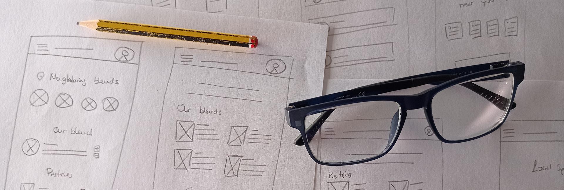
From paper to pixels
I started with paper sketches to explore layout options without getting attached to visual details. The initial concept placed booking, menu, and restaurant info in separate tabs — a conventional pattern that felt logical on paper.
What testing revealed
Usability testing with five participants exposed three problems I hadn’t anticipated:
-
The app didn’t read as a booking tool. Because menu and recipe content was prominent, multiple participants assumed the app was a recipe platform. The core function — reservations — wasn’t clear enough at first glance.
-
Booking felt fragmented. Splitting reservation inputs across multiple screens created unnecessary friction. Participants lost track of their selections and wanted to see everything in one place before confirming.
-
Everyone asked about guest access. Unprompted, several participants questioned why account creation was required. For a restaurant booking, the expectation was low-commitment — closer to ordering coffee than signing up for a service.
These findings drove three rounds of iteration, each directly tied to a specific testing insight.
Solutions
Reframing the home screen
The first redesign prioritized booking and menu access as the two primary actions on the home screen. Recipe content — which users valued but misidentified as the app’s purpose — was repositioned as a secondary feature. This single change resolved the identity confusion without removing functionality.
One-Screen booking with confirmation
All reservation inputs were consolidated into a single interface: date, time, party size, and seating preferences visible together. A confirmation screen was added as a final step, displaying every detail before submission. Participants in follow-up testing reported feeling more in control of the process.
Flexible Authentication
Three pathways were introduced: Google sign-in for speed, email registration for users who wanted saved preferences, and guest checkout for those making a one-time reservation. This removed the biggest friction point without sacrificing the benefits of accounts for returning users.
Recipes as a retention feature
Rather than cutting the recipe section, it was repositioned as a value-add — a way for users to recreate restaurant dishes at home. This responded to a real behavior pattern observed during research: users who enjoyed a meal often searched for similar recipes afterward. Keeping this feature maintained engagement beyond the transactional booking moment.
Reflection
The biggest lesson from this project was how quickly initial assumptions fell apart under research. What started as a “make booking faster” brief became a more nuanced problem about information confidence — users didn’t just want to book, they wanted to book knowing they’d made the right choice.
If I were to continue iterating, I’d focus on two areas: adding allergen filtering directly into the menu browsing experience, and exploring how Thomas’s use case — group bookings with mixed dietary needs — could be better supported with shareable reservation previews.
This project reinforced something I keep coming back to: the most useful design decisions come from watching people struggle with something you thought was obvious.
Next Project
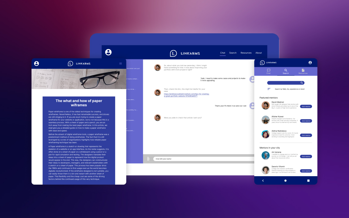
LinkArms