UX Designer
LinkArms
A mentorship platform that bridges the gap between college students and working professionals, pairing guided connections with curated resources to ease the transition into the workforce.
Role
UX Designer
Timeline
3 weeks
Tools
Figma
Team
Solo project
The problem
Entering the workforce after college is overwhelming. Students and recent graduates often lack professional connections, industry-specific guidance, and access to curated resources that could help them navigate their first career steps. Existing platforms either focus on job listings without mentorship or offer mentorship without structured resource sharing.
LinkArms started with a question: what if a single platform could connect young professionals with experienced mentors while also providing the resources they need to succeed?
Research & Discovery
I began with the assumption that users primarily needed a connection tool — something to match students with mentors and get out of the way. Interviews quickly complicated that picture.
Research revealed that college students would primarily access the platform through a mobile app, treating it like another social network they check throughout the day. But an important secondary finding emerged: older professionals — the mentors — preferred accessing the platform on larger screens like tablets or desktops. A mobile-only solution would serve one side of the equation while alienating the other.
This shifted the project scope from a standalone app to a cross-platform solution — a mobile app paired with a responsive website, ensuring both students and mentors could engage comfortably on their preferred devices.
Personas
Two personas emerged from the research to anchor design decisions:
Albert, 21 — College Student. Approaching graduation with limited professional experience. He’s motivated but uncertain about how to break into his field. He wants structured guidance from someone who’s already navigated the transition — not generic career advice from a website, but a real person who understands his specific situation.
Liz, 34 — UX Designer. A self-taught designer who remembers how difficult it was to start without guidance. She wants to mentor younger professionals and share the resources that helped her grow. Her main concern is that volunteering her time should feel organized and worthwhile, not chaotic or poorly structured.
Design process
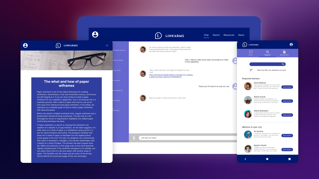
From paper to pixels
The design process started with a Crazy Eights exercise to rapidly explore different layout concepts. These quick sketches became the foundation for paper wireframes, which were then digitalized and evolved into interactive prototypes ready for testing.
The initial concept organized the app around three core areas: mentor search, messaging, and resources — each accessible through conventional navigation patterns.
What testing revealed
Usability testing exposed three challenges that directly shaped the final design:
-
Hamburger menus created friction. Despite being a familiar convention, participants found the hamburger menu cumbersome. Accessing different sections required multiple taps and felt slower than expected for an app they’d use frequently.
-
Cross-platform inconsistency broke trust. Early prototypes didn’t maintain visual or functional consistency between mobile and desktop. Participants who tested both felt like they were using two different products, which undermined confidence in the platform.
-
Resources felt like a dead end. The resources section lacked any filtering or search functionality. Participants scrolled aimlessly through content without a way to find what was relevant to their field or interests.
These findings drove three focused design iterations, each targeting a specific usability problem.
Solutions
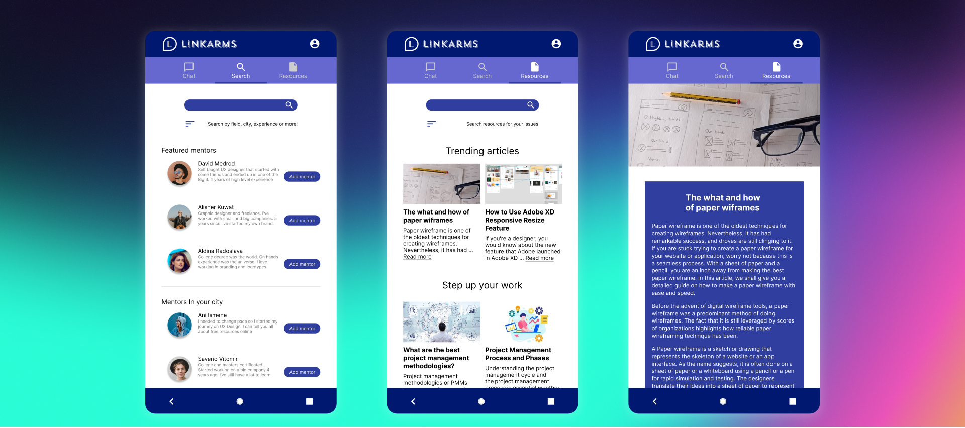
Replacing the hamburger with direct access
The hamburger menu was replaced with a persistent tab bar providing single-tap access to all primary sections. This reduced navigation from a two-step process (open menu, then select) to a one-step action, removing friction for an app designed to be checked frequently throughout the day.
Unifying the Experience Across Devices
Two parallel strategies ensured a seamless experience across devices. On the design side, both platforms shared identical color palettes, typography, and component patterns, with responsive adjustments for weight and size rather than entirely different layouts. On the functional side, chat history and user activity would synchronize across devices — a conversation started on mobile continuing seamlessly on desktop.
Turning Resources into a Usable Tool
The resources section was rebuilt with search and filter capabilities, allowing users to find content by topic, format, or relevance to their field. This transformed what had been a passive content dump into an active tool for professional development. Future iterations would add the ability for users to curate, save, and share their own resource collections.
Reflection
This project taught me that designing for two distinct user groups within the same platform requires more than just accommodating different screen sizes. Students and mentors have fundamentally different motivations, usage patterns, and expectations — and the design needs to respect both without compromising either.
If I were to continue iterating, I’d focus on the onboarding experience for mentors like Liz — making it easier to define availability and mentorship scope upfront — and on refining the mentor search to help students like Albert find not just any match, but the right one for their specific goals.
This is the kind of product I wish had existed when I finished my own degree — and that awareness kept the work grounded in real needs rather than theoretical features.
Next Project
Extension Redesign