Product designer
Extension Redesign
Redesign of Harmonix's core product: migrating from an extension injected into every web page to a single Side Panel, simplifying the architecture, removing unused features, and improving product stability.
Role
Product designer
Timeline
1 year
Tools
Figma
Team
Harmonix
Context
Harmonix is a tool that sits on top of users’ existing CRM workspaces — Outlook, Salesforce, Dynamics, LinkedIn — and unifies their communication and information tools. It works primarily through a browser extension that adapts to the content of each web page, but it also includes a web application that serves as a control center: settings for administrators and personalization for each user (signature, default phone numbers, avatar…).
As a Google Chrome extension, it requires specific Google permissions to overlay on any web page.
The Problem
The extension had an architectural problem that directly affected the experience. Every time a user navigated to a new page, a new instance of the extension was loaded — with its own phone dialer, email, messaging — which caused conflicts between instances, unexpected reloads, and loss of context. On top of that, each web page has a different internal structure, which required a custom adaptation process to ensure the extension didn’t cover or displace each site’s native elements.
The result was an extension that behaved unreliably and required a disproportionate technical effort to maintain.
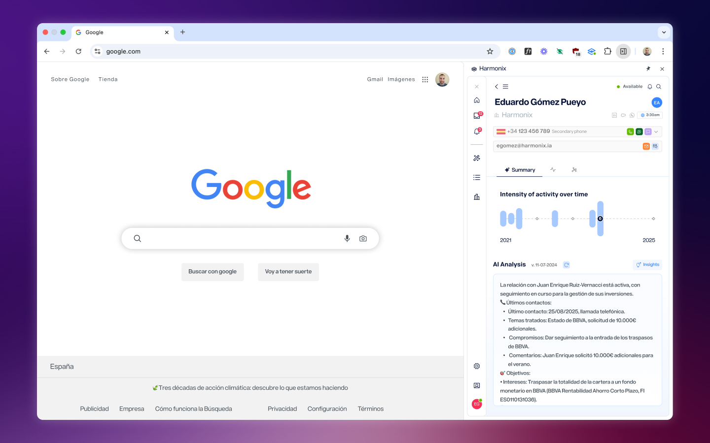
The opportunity appeared when Google introduced the Side Panel: a dedicated browser space for extensions, independent of page content. A single instance, no need to inject into every page, no conflicts. This wasn’t just a technical improvement — it was a chance to rethink the entire experience of the core product.
What Customers Told Us
Customer feedback reflected the architectural problems as concrete frustrations: calls sometimes didn’t come through, the extension reloaded after a period of inactivity, it sometimes didn’t appear where it should, and synchronization between views wasn’t reliable. These were different symptoms of the same underlying issue — each page loaded its own instance and there was no guarantee of stability.
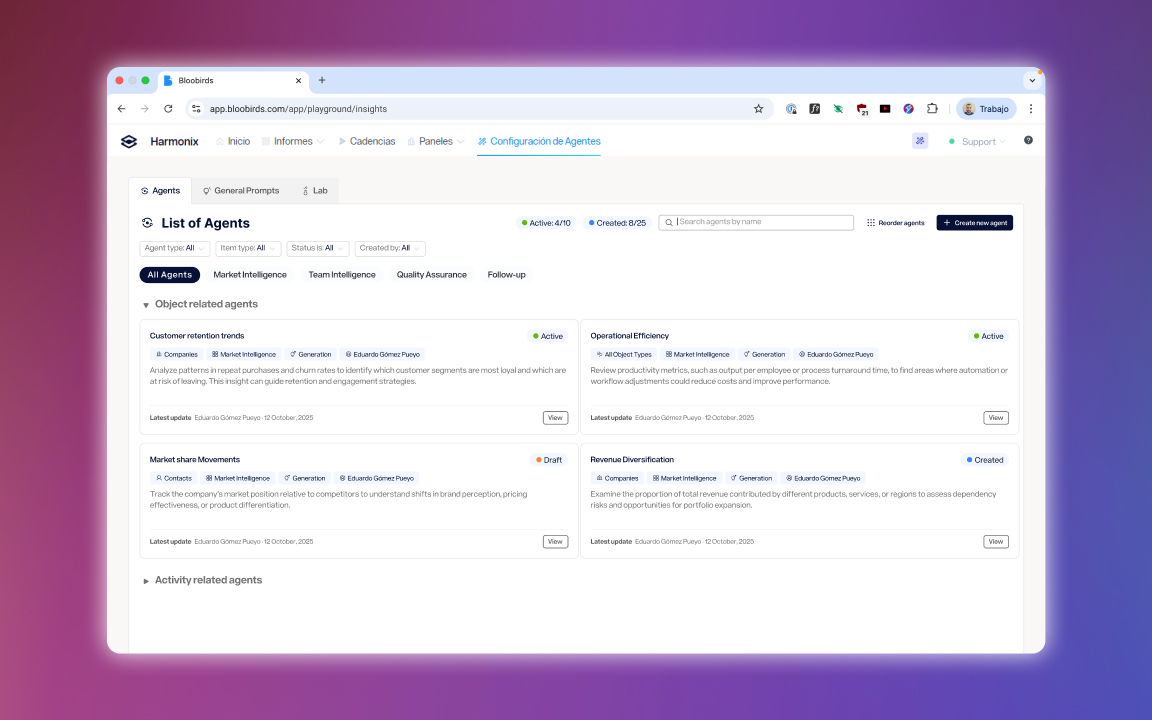
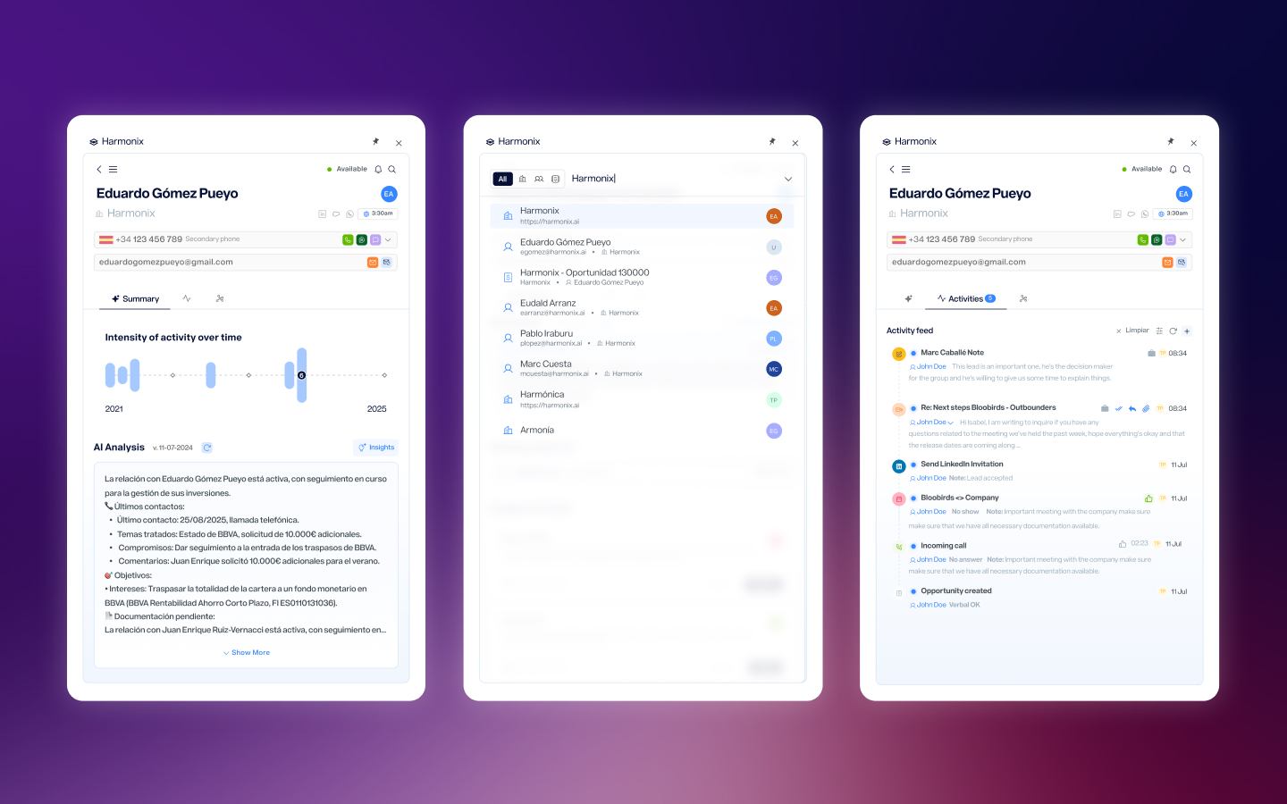
But beyond the technical problems, conversations with customers also revealed something about the product itself: there were features nobody used. The nurturing section, the outbox, certain views that had been added over time — customers didn’t mention them because they simply ignored them. Meanwhile, the features they actually valued — contact detail, activity history, follow-up suggestions — were buried among everything else.
The redesign couldn’t just be a change of container. It also had to be an opportunity to decide what deserved to keep existing.
Solutions
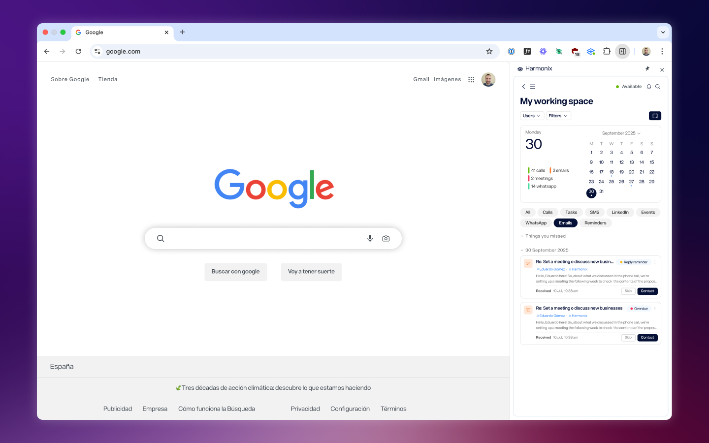
One Instance, One Persistent Context
Migrating to the Side Panel solved the multiple-instance problem at its root. The extension now lives in a single browser space, independent of whatever page the user has open. This eliminated unexpected reloads, dialer conflicts, and context loss when navigating. For development it meant a much more manageable control point; for users, an extension that finally behaves predictably.
Removing What’s Unused, Merging What’s Redundant
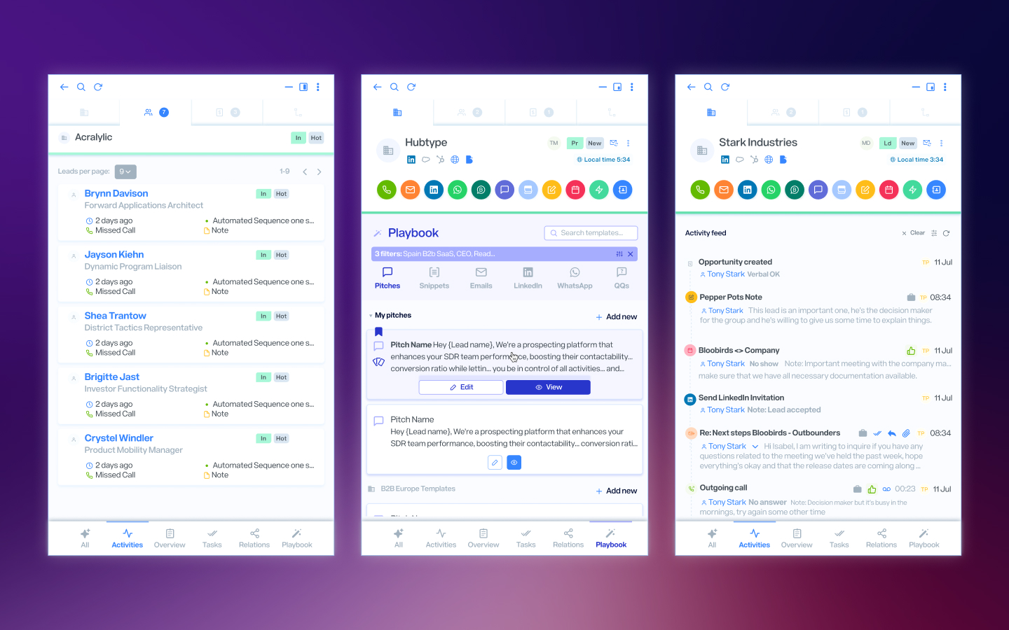
The change of container brought the opportunity to review all the content. Sections nobody used — nurturing, outbox — were removed. Those that were too similar, like tasks and inbox, were merged into a single view. The goal was for every element in the Side Panel to justify its presence: if it didn’t deliver demonstrable value, it didn’t deserve the space.
Reorganizing Navigation for a Smaller Space
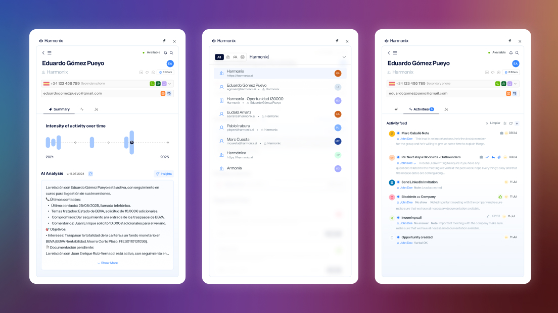
The original extension had a left sidebar for navigating between general views (tasks, inbox, pipeline) and a contact detail area on the right with activity history, follow-up suggestions, and AI agent reports. When compressing everything into the Side Panel, that structure no longer worked. Navigation was redesigned so that primary views and contact detail could coexist fluidly in a smaller space, prioritizing what users consulted most frequently.
Reflection
This was a year-long project and the hardest decision wasn’t technical — it was deciding what to remove. When you’ve been designing a product for a while, you know every feature and you know how to work around its problems, which makes it easy to justify keeping everything. But customers don’t see what you see: they see features they ignore competing for space with the ones they actually need.
The Side Panel migration forced that conversation. It wasn’t possible to carry everything over as-is into a smaller space, so every feature had to earn its place. That constraint turned out to be the project’s best design tool: it forced decisions that had been pending for a long time.
If I were to continue iterating, I’d focus on measuring how the simplification has affected adoption of the features that were kept, and on exploring how the Side Panel could adapt contextually — surfacing different information depending on which page the user has open, without falling back into the problems of the previous architecture.
Next Project
AI Agents