Product designer
Mobile App
Designing Harmonix's mobile companion app from scratch — bringing CRM context, calling, and messaging to field sales reps without recreating the complexity of the desktop experience.
Role
Product designer
Timeline
1 year
Tools
Figma
Team
Harmonix
Context
Harmonix is a tool that sits on top of users’ existing CRM workspaces — Outlook, Salesforce, Dynamics, LinkedIn — and unifies their communication and information tools. It works primarily through a browser extension and a web application — both desktop experiences, designed for a screen with space to work.
The Situation
Not every sales rep works from a desk. Field reps travel to client meetings, account managers step away from their computers, and deals don’t pause because someone is on the move. Without a mobile app, Harmonix users lost access to their CRM context the moment they left their desk — and had to rely on the native phone app to make calls, which meant no logging, no recording, and no connection to the platform that was supposed to unify their work.
The opportunity was clear: bring the core of Harmonix to mobile, so that the platform stays useful regardless of where the rep is.
The Challenge
The desktop experience is rich. The extension alone surfaces contact detail, activity history, AI agent results, pipeline views, and a full communication suite. Reproducing that faithfully on a phone screen wasn’t the goal — and wasn’t possible. The real design problem was deciding what “the core of Harmonix” actually meant on mobile: what a rep genuinely needs when they’re on the go, and what can wait until they’re back at their desk.
The answer shaped everything: contact context, communication, and logging — fast and reliable, without the overhead of the full platform.
Solutions
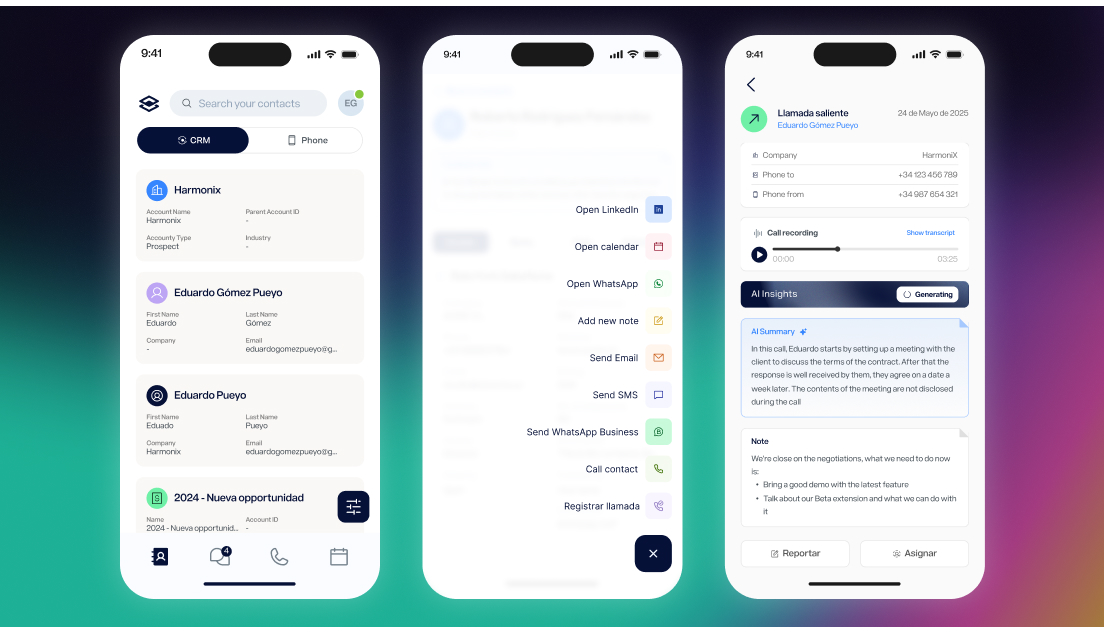
Two contact worlds, one search
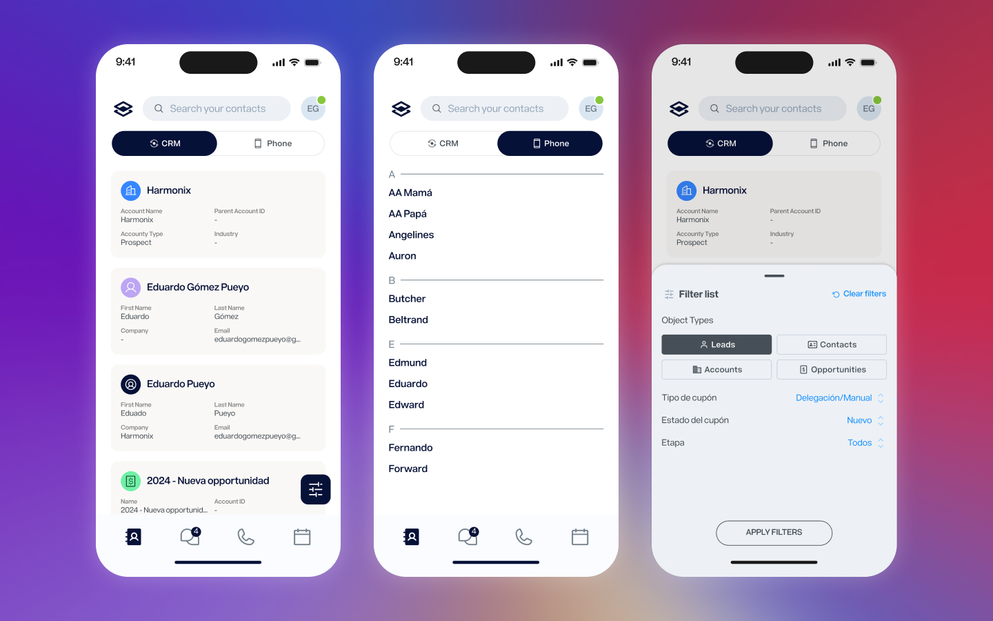
Sales reps live between two address books: the CRM, which holds their professional contacts and account data, and the native phone, which holds everyone else. The app unifies both in a single contact list, toggling between CRM and phone contacts without leaving the screen. CRM contacts sync automatically with the main platform and can be filtered by object type and custom fields. Phone contacts appear once permission is granted, indexed alphabetically just like the native experience users already know.
The contact as the hub
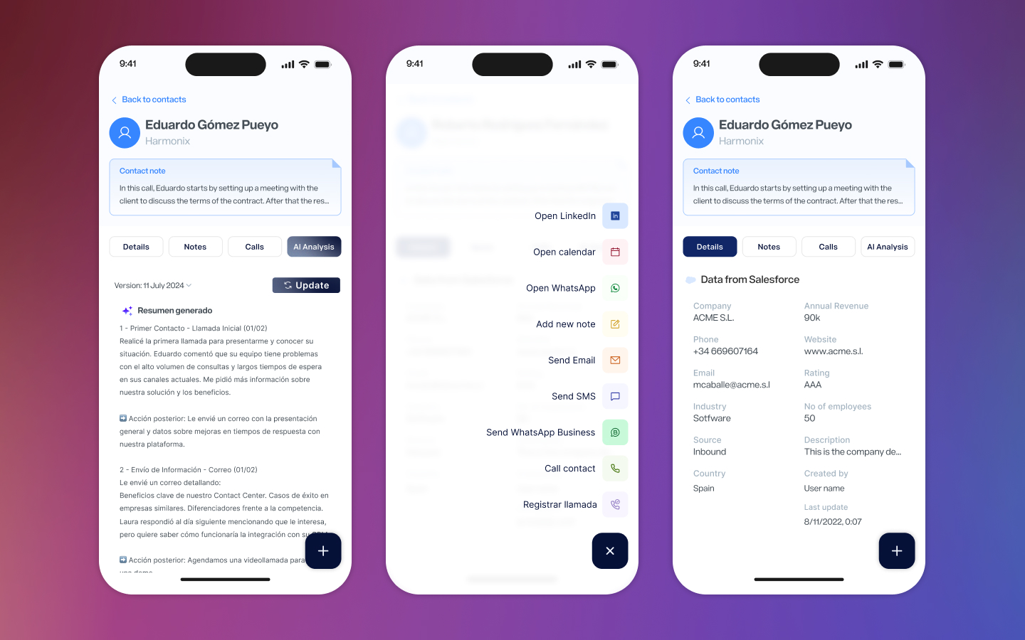
The contact detail view is where most of the work happens. A persistent header keeps name, company, and the AI-generated contact note always visible while the user navigates between four tabs: Details, Notes, Calls, and AI Analysis. Details pulls live data from the connected CRM — Salesforce, Dynamics — showing exactly the fields each account has configured. Notes collects written and voice notes chronologically. Calls shows the full call history for that contact. AI Analysis surfaces the same agent outputs available in the extension, bringing the intelligence of the platform to wherever the rep is.
From the contact view, a single button expands into the full action menu: call, send WhatsApp Business, send SMS, send email, open LinkedIn, open calendar, add note, register call manually. Every action a rep might need in the field, one tap away.
A native call experience
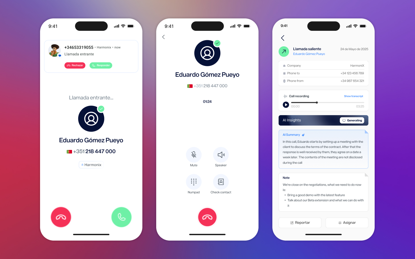
Calls through Harmonix needed to feel like calls — not like a third-party tool interrupting the phone experience. The incoming call screen uses the native notification layer, with the caller’s name and company surfaced from the CRM the moment the phone rings. The active call screen is intentionally minimal: the essential controls — mute, speaker, numpad, and a shortcut to check the contact — without anything that would distract during a conversation.
After the call ends, the detail view shows the recording, a transcript, AI-generated insights, and any notes left during or after the call. Everything is logged automatically and synced back to the platform.
Messaging unified
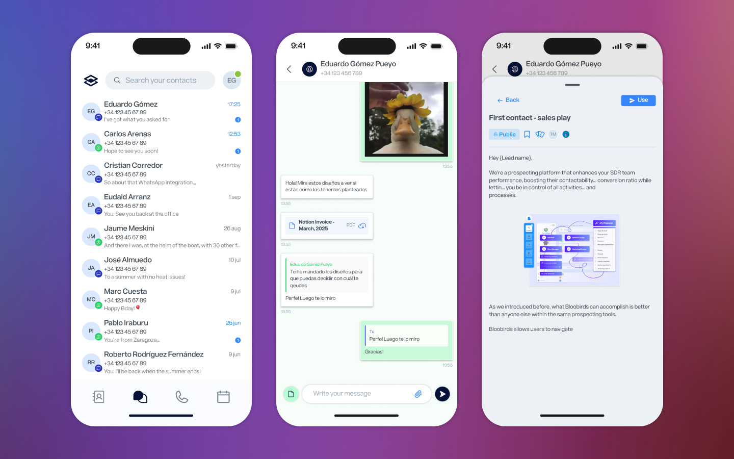
WhatsApp Business and SMS conversations live together in a single inbox, ordered by recency. The distinction between channel types is handled through color — green for WhatsApp, purple for SMS — so the list stays clean while the content stays distinguishable. In the conversation view, WhatsApp Business capabilities are fully available: files, photos, approved Meta templates. For reps managing client communication across channels, this removes the need to jump between apps.
Reflection
This project launched on Android in December 2024 and has continued shipping updates through late 2025. The hardest ongoing design decision wasn’t about any individual screen — it was about scope. The desktop platform can do a lot, and every feature had someone who wanted it on mobile. The constraint of the phone screen, rather than being a limitation, became a useful forcing function: if something couldn’t be done simply, it probably shouldn’t be on mobile at all.
The result is an app that doesn’t try to replace the desktop experience — it covers the moments when the desktop isn’t available, and does that well.
Next Project
Dashboards redesign